Appearance
Launchpad Design
The Launchpad is the page a browser opens on localhost: every project, its links, and what is running. This brief (#2144) sets how it looks. It should feel like the control surface of a working system. The surface is dark and has depth, live things glow quietly, motion has a reason, and a few clear sizes of type say what matters. The page must still load instantly.
The brief comes first; the stylesheet in scripts/launchpad/render-page.js follows it. Every colour, font, type size, radius, shadow and animation length in that stylesheet is a custom property named here, and tests/test-launchpad-design.js fails on one that is not. Spacing stays on the 4px grid below. If the CSS needs a value with no token, add the token to this brief first.
Limits
These are fixed. A design idea that breaks one is dropped.
- No requests. No webfont, no icon font, no image, no script or style from anywhere. The page is one HTML file. A test checks it.
- No framework. Plain CSS and a small amount of plain JavaScript.
- 60 KB. The inline CSS plus the inline JavaScript, as served, stay under 60 KB uncompressed. A test asserts the ceiling. The page compacts what it emits: it drops comments and indentation, and the source keeps both. The ceiling was 40 KB until the graph view (#2153). It was raised once for the graph and the command palette (decision #3535).
- Both themes follow the system. The page follows
prefers-color-scheme. Light is not dark with the colours flipped. Each theme has its own tokens, chosen for that background.
Colour tokens
Each token has one job. The CSS uses the token for that job, never a hex value.
| Token | Job | Dark | Light |
|---|---|---|---|
--bg | Page background | #0b0f17 | #f3f5f8 |
--panel | Tiles, cards, columns, the filter box | #121925 | #ffffff |
--raised | A surface lifted above a panel (popover, dragged tile) | #18212f | #ffffff |
--line | Hairlines and resting borders (decorative) | #243042 | #d5dbe3 |
--ink | Body text, names | #e6edf6 | #0f1722 |
--dim | Secondary text: ports, stack, counts, hints | #8d99ab | #56606e |
--pill / --pill-ink | A link pill at rest | #1c2635 / #dbe4f0 | #e9edf2 / #1b2430 |
--live / --live-ink | Up: a dev server that answers; the dev pill; the active view | #3ddc84 / #04130a | #0f7a3d / #ffffff |
--down | Down: a server that does not answer; the start action | #ff6b6b | #c0272d |
--warn | Production links, a starting server, a port collision | #e3b341 | #8a5a00 |
--focus | The keyboard focus ring | #6cb6ff | #0a5fd6 |
Contrast (WCAG 2.x), checked by tests/test-launchpad-design.js from the CSS itself, so a token change that breaks it fails the build:
| Pair | Dark | Light |
|---|---|---|
--ink on --bg / --panel | 16.3 / 15.0 | 16.5 / 18.0 |
--dim on --bg / --panel / --pill | 6.7 / 6.1 / 5.3 | 5.8 / 6.4 / 5.4 |
--pill-ink on --pill | 11.9 | 13.3 |
--live-ink on --live (the dev pill) | 10.7 | 5.4 |
--live on --panel (Up counts, hover text) | 9.9 | 5.4 |
--down on --panel (start, Down counts) | 6.4 | 5.9 |
--warn on --bg / --panel (prod, warnings) | 9.9 / 9.1 | 5.4 / 5.9 |
--focus on --bg (the ring, a non-text 3:1 minimum) | 8.9 | 5.3 |
Every text pair is at least 4.5:1 (AA). --line is decorative and is never the only way to tell two states apart.
What the liveness colours mean
The colour of a dot, band or column means one thing everywhere on the page:
| State | Colour | Treatment |
|---|---|---|
| Up: the server answers | --live | Filled dot. A live surface has a soft glow that breathes slowly (see Motion). |
| Down: it does not answer | --down | Filled dot, flat. No glow: a down thing never looks alive. |
| Unknown: not probed yet, or nothing to probe | --dim | Hollow dot, flat. |
Starting: bob dev up is running | --warn | The dot or button pulses until the probe answers. |
A live surface is a tile whose dev server is up, a card in the board's Up column, and a port-map band whose dev port is up. The glow is CSS only: no script decides it. Down and unknown surfaces have no glow.
Type
- UI text uses the system sans stack (
--font-ui:system-ui,-apple-system,"Segoe UI",Roboto,"Helvetica Neue",Arial,sans-serif). The page never fetches a webfont. - Identifiers use a mono stack (
--font-mono:ui-monospace,"SF Mono","Cascadia Code",Menlo,Consolas,monospace). These are project names, ports, keys and stack terms: things you would type. - Ports and counts use tabular numerals (
font-variant-numeric: tabular-nums), so:5200and:5210line up.
| Token | Size | Used for |
|---|---|---|
--fs-xs | 0.75rem (12px) | Column headings, GitHub pills, the port-map strip |
--fs-sm | 0.8125rem (13px) | Ports, stack terms, counts, hints |
--fs-md | 0.875rem (14px) | Body, pills, buttons |
--fs-lg | 1rem (16px) | Project names |
--fs-xl | 1.125rem (18px) | The page title |
Hierarchy comes from weight and colour before size. A name is --ink at 600; everything about it is --dim.
Spacing, shape, depth
- Spacing is a 4px grid:
--sp-10.25rem,--sp-20.5rem,--sp-30.75rem,--sp-41rem,--sp-51.25rem. - Radius:
--r-sm4px (keys, small buttons),--r-md8px (tiles, cards, columns),--r-pill999px (pills, counts). - Depth is three steps.
--shadow-1is a panel at rest,--shadow-2is a hovered or focused panel, and--shadow-3is something you are dragging. Panels also carry a faint top highlight (--sheen), so a surface reads as lit from above. In light the shadows are softer and the highlight is not needed.
Motion
Motion shows that something changed or that something is alive. It is never decoration.
| Token | Value | Used for |
|---|---|---|
--dur-fast | 120ms | Hover and press feedback |
--dur | 180ms | A tile settling, a card moving column (FLIP), a popover opening |
--ease | cubic-bezier(0.2, 0.8, 0.2, 1) | Everything that moves |
--breathe | 2.8s | The live glow's slow cycle |
--pulse | 1s | A server starting: the dot or start button pulses |
- Nothing that moves takes longer than 200ms. The live glow and the starting pulse only change brightness, so they are slower.
- Under
prefers-reduced-motion: reducethere is no animation and no transition, and live surfaces have no glow. Changes still happen; they just land. State stays readable from colour and the filled dot.
States
Every control has a designed state for each way you can touch it:
| State | Treatment |
|---|---|
| Hover | The border goes from --line to --dim (panels) or --live (pills, buttons), and a panel steps up to --shadow-2 |
| Focus (keyboard) | A 2px --focus ring outside the control. It is never removed: a control may restyle its border, but the ring stays |
| Active (pressed) | The control dips 1px and loses its lift |
| Drag (tiles) | --shadow-3, a --live border, slightly see-through; the slot it would drop into is a dashed outline |
| Selected (view, group key) | Filled with --live (view) or outlined in --live (group key) |
These apply to tiles, board cards, pills, the view switcher, the group-by buttons, the start buttons and the port-map segments.
What it looks like
Every view in both themes after this pass, from a fixture index with stubbed liveness (atlas and delta-web up). The port map is shown with a band hovered. The pass started from the page in the last column.
| View | Dark | Light | Before |
|---|---|---|---|
| Tiles | 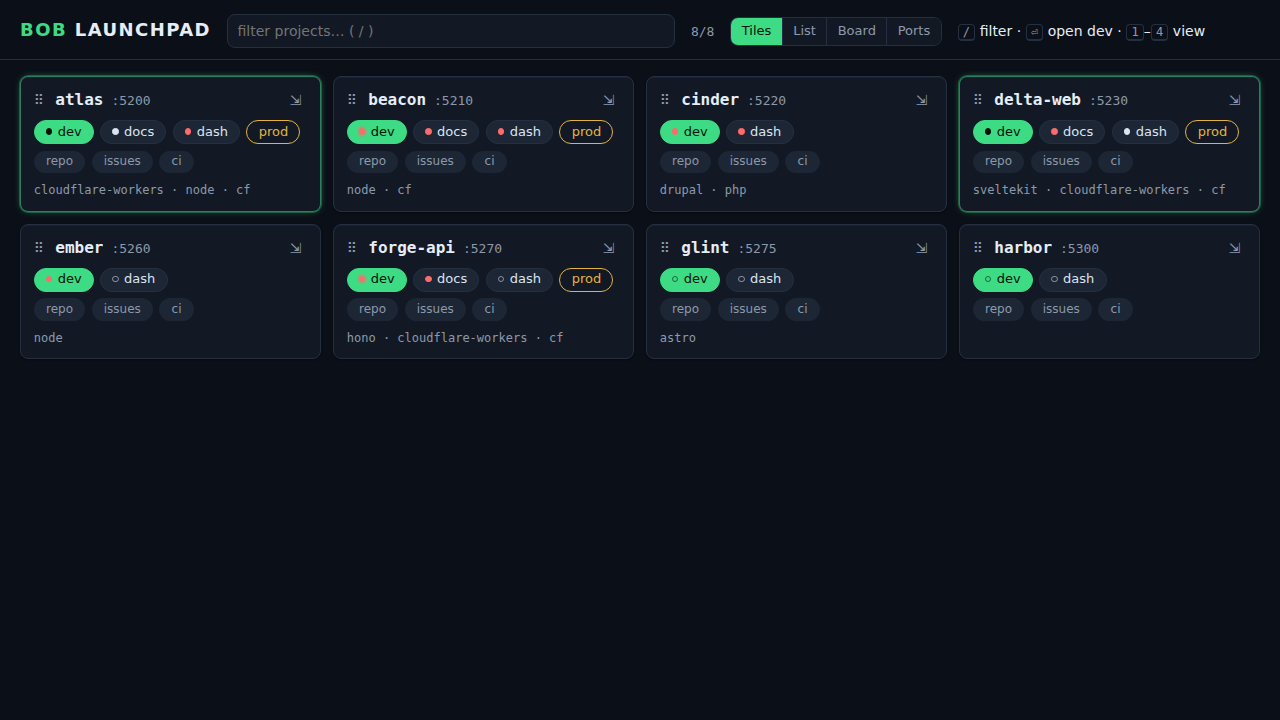 | 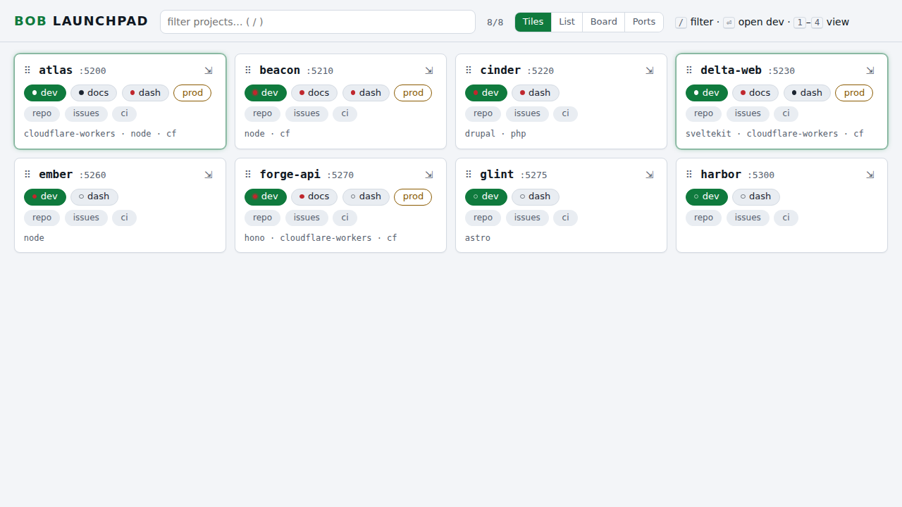 | dark · light |
| List | 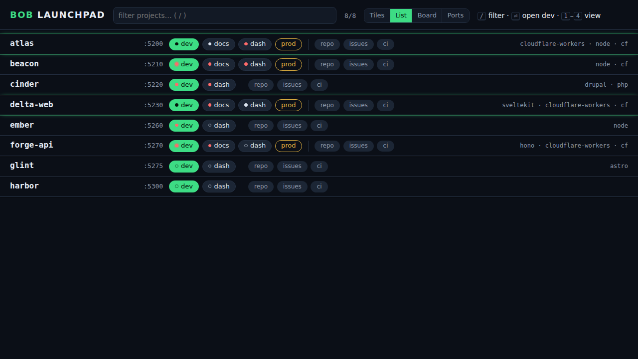 | 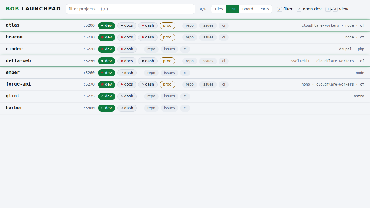 | dark · light |
| Board | 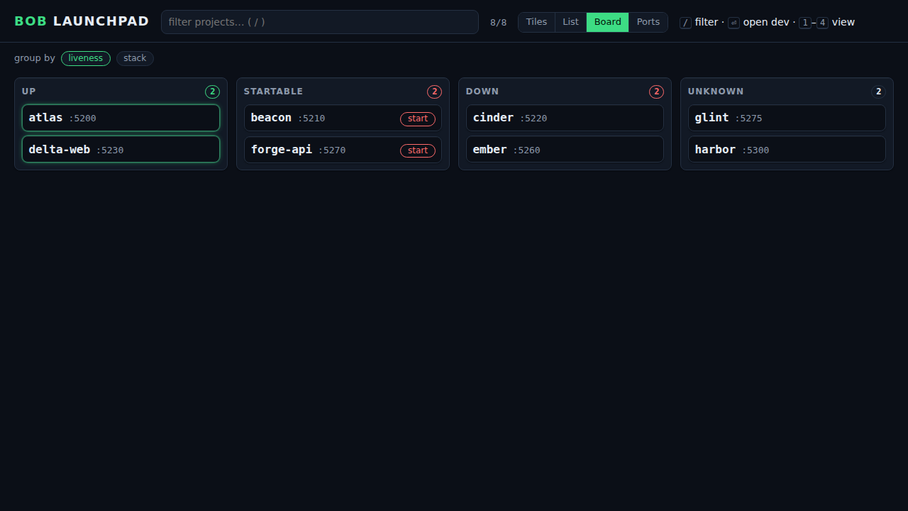 | 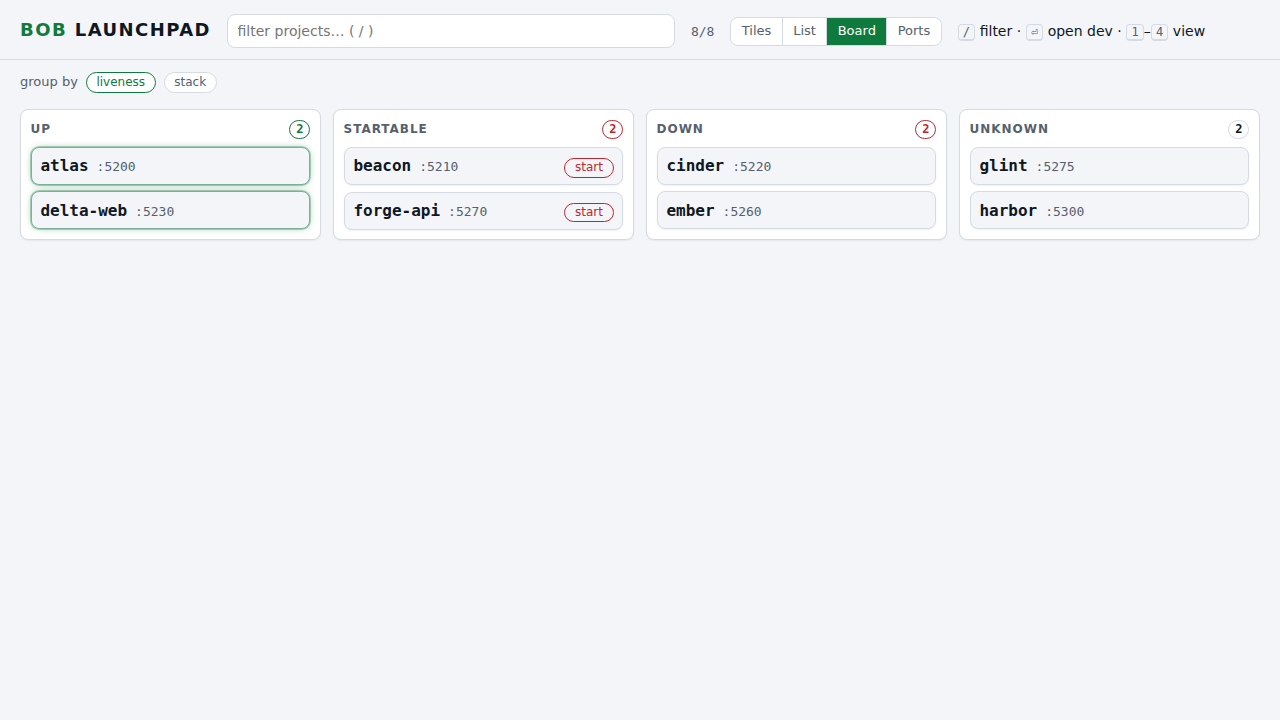 | dark · light |
| Ports | 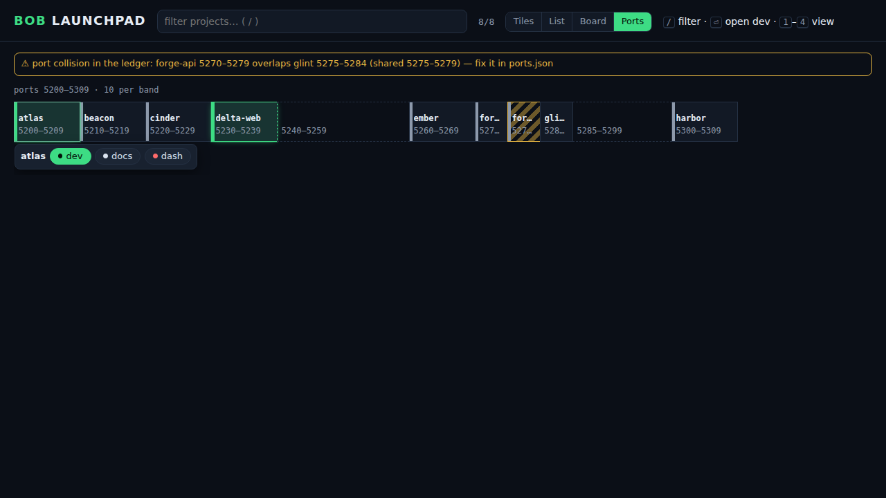 | 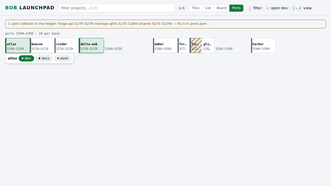 | dark · light |


Related
- Regenerate the Launchpad Page: what each view does.
- Launchpad Links Index: the data the page is built from.